
Branding · 2025
High Key Coffee & Kitchen
A playing-card identity for a café that raises the stakes on flavour.
- Client
- High Key Coffee & Kitchen
- Year
- 2025
- Services
- Branding
- Industry
- Café and kitchen
- Deliverables
- Identity, packaging, print, signage
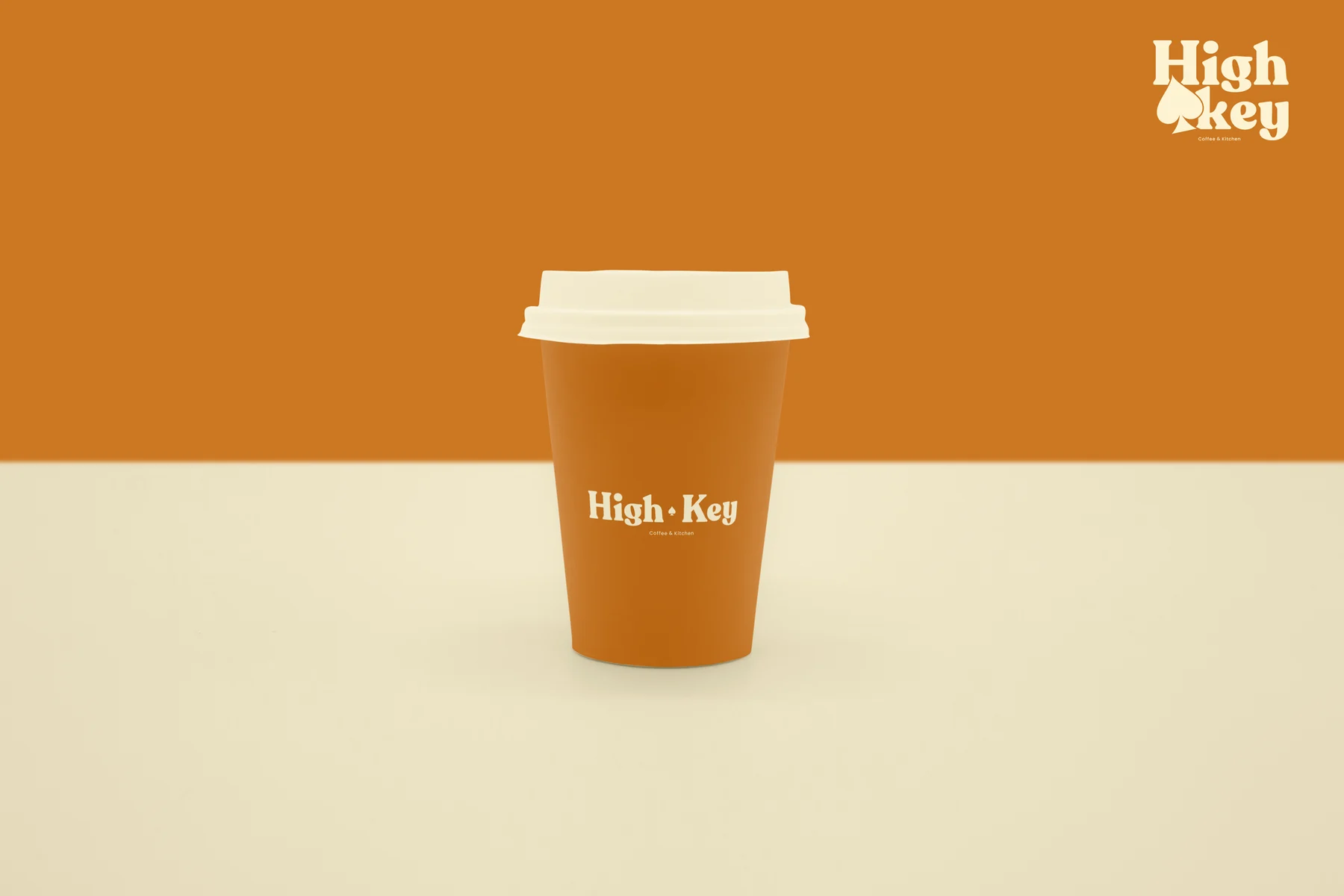
Brand identity for High Key Coffee & Kitchen: a logo with a spade for its "key", a warm colour and type system, and every touchpoint a café needs, from cups and boxes to the menu, merchandise and shop sign.
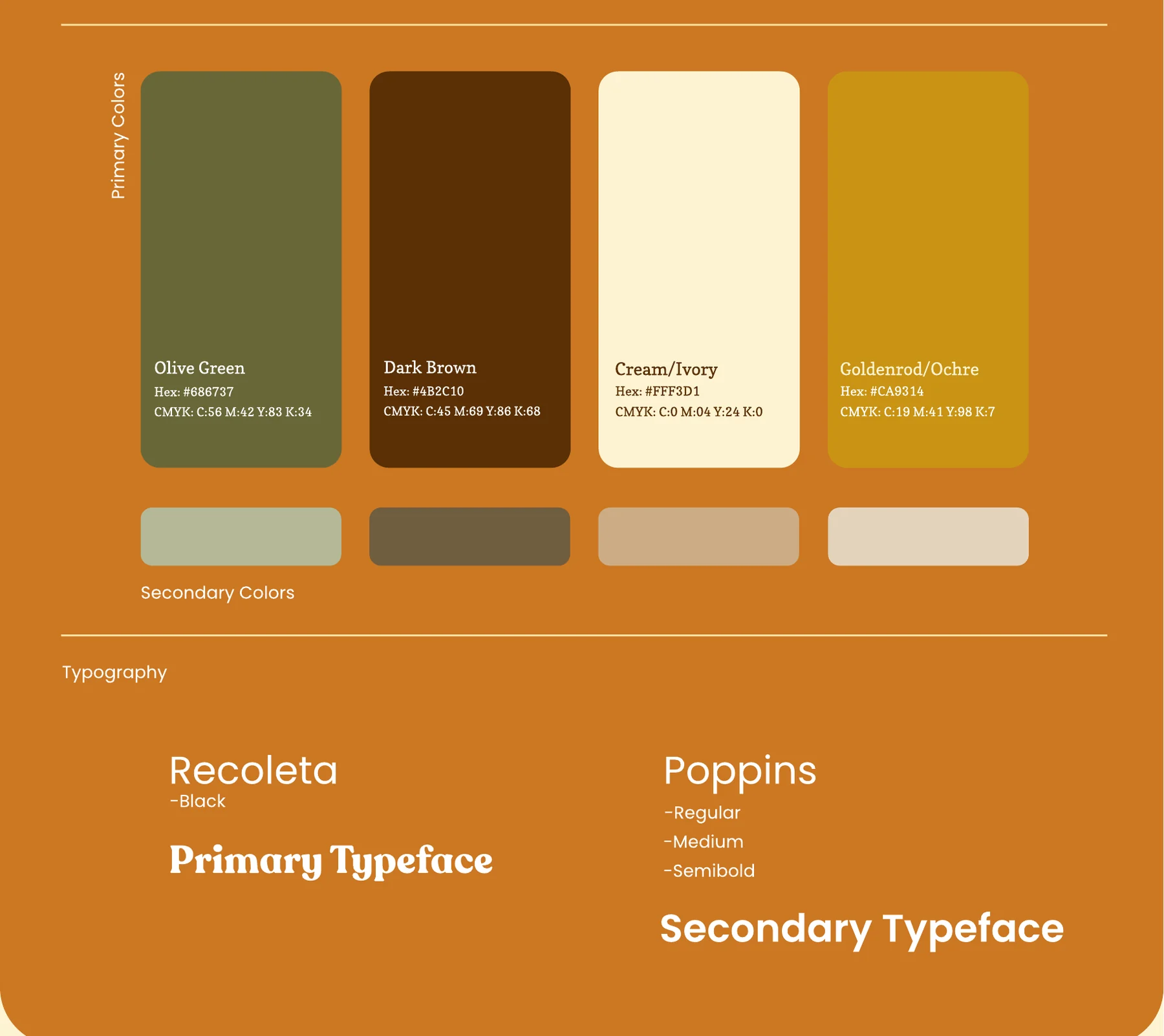
4Core colours: olive, brown, ivory, ochre
2Typefaces: Recoleta and Poppins
10Touchpoints, from cups to the shop sign
The brief
A new coffee and kitchen spot needed a name to come alive: playful but grown up, warm enough for a morning coffee and bold enough for a shop front. It had to work on everything from a cup sleeve to a street sign.
What we did
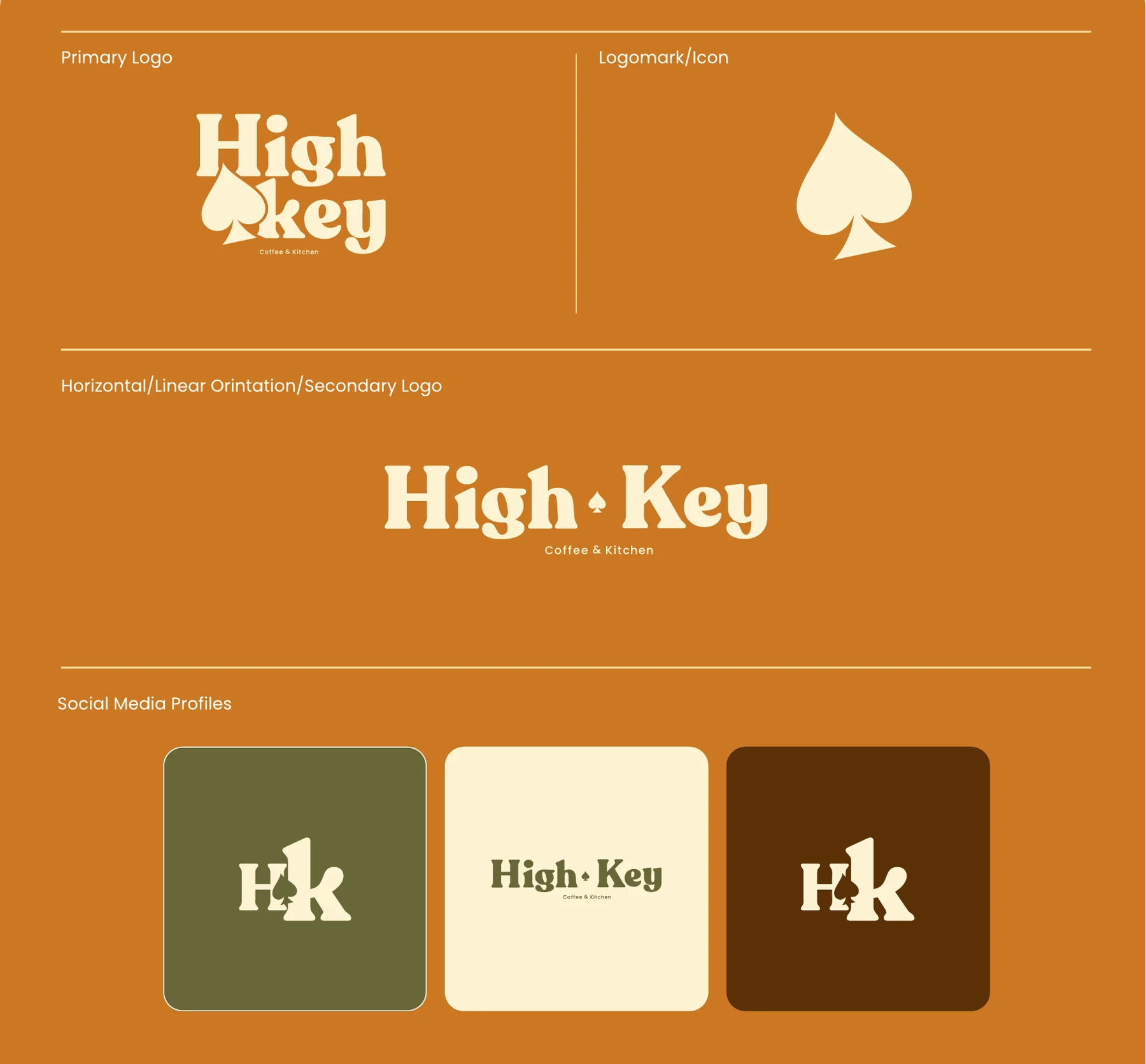
- A logo with a wink. The spade from a deck of cards stands in for the "key", so the mark reads as High Key and feels like a winning hand.
- A warm palette. Olive green, dark brown, ivory and ochre, with softer secondary tones for print and packaging.
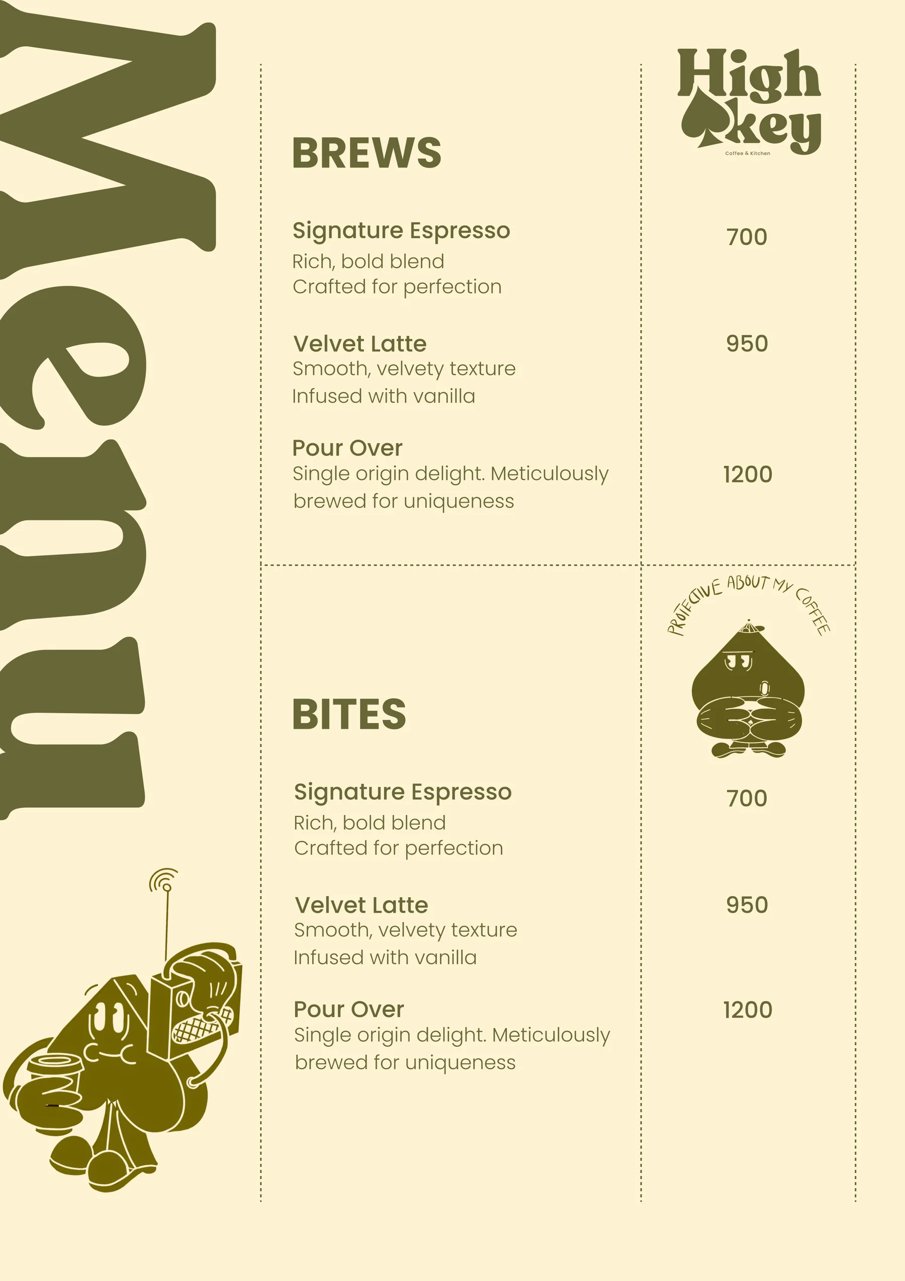
- Type with character. Recoleta Black for the logo and headlines, Poppins for menus and everyday text.
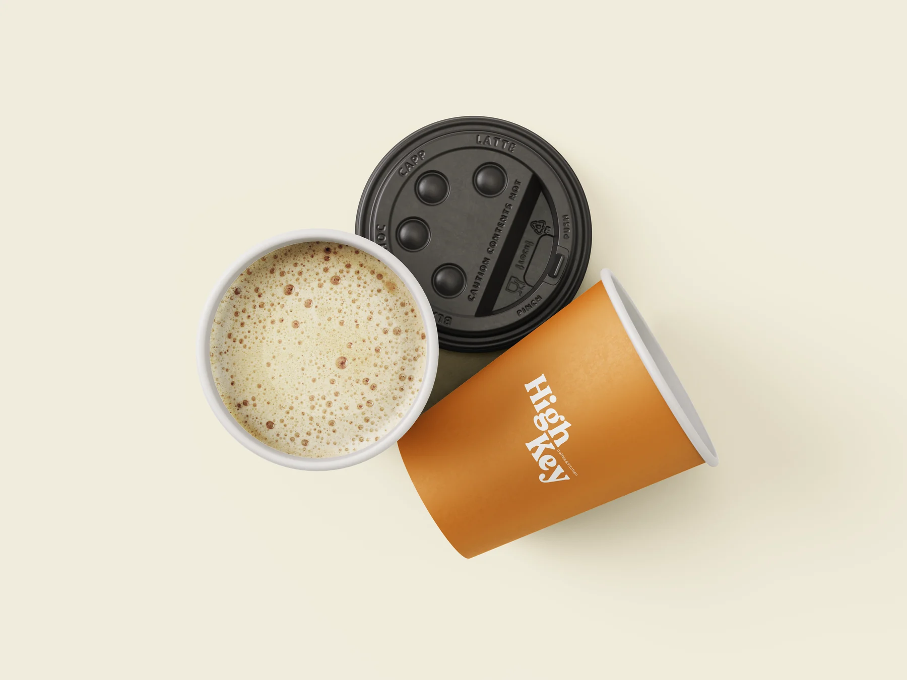
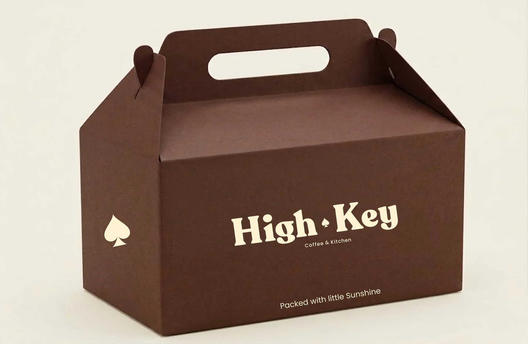
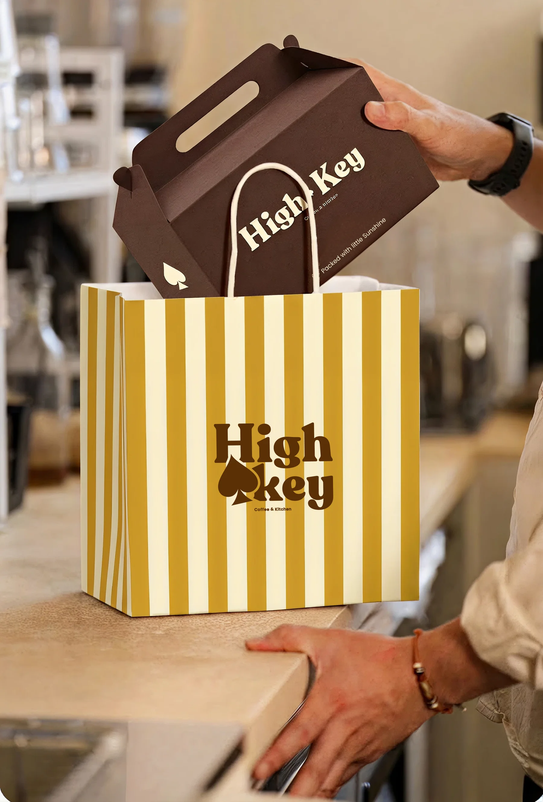
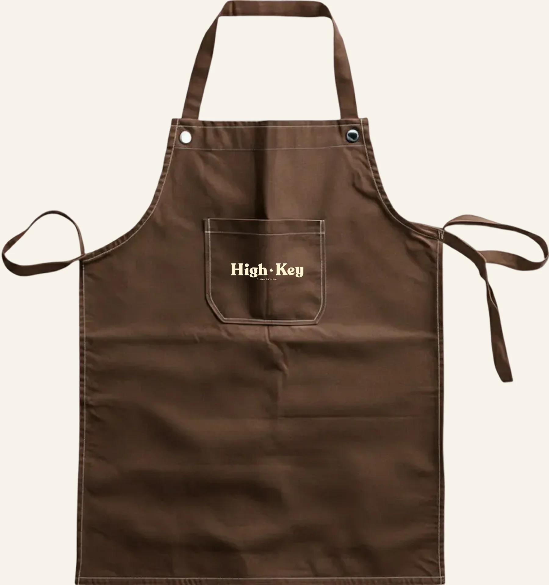
- Every touchpoint. Cups, takeaway boxes, bags, an apron, a menu, social posts, a music poster and the shop sign, all in one family.

Raise the stakes on flavour.
Services on this project:Branding
Next case studyInvitation Maker